The Space of Spaces

As a first step, we load the multi-modal embeddings of floor plans. Note that we do not share the project page of the multi-modal floor plan model because that work is under review at the moment. The embeddings are stored in assets/embeds/

Code
import torch
ids, embs = torch.load(r"../assets/embeds/mm_embeds.pt", weights_only=False)

# decompose into modality-specific embeddings
emb_graphs = embs["graph"].numpy()
emb_images = embs["img"].numpy()
emb_walls = embs["wall_graph"].numpy()

# check dataset size and dimensionality of the embedding space
print(f"Dataset size (N): {len(emb_images)}")
print(f"Dimension of embedding (d): {emb_images[0].shape[0]}")
Dataset size (N): 7168
Dimension of embedding (d): 768

Dimensionality reduction through UMAP

A dataset size of \(7168\) means that the total number of embeddings is \(3x7168=21504\). Next, we run UMAP (\(768D \rightarrow 2D\)) on this entire set of embeddings.

Code
import umap
import numpy as np
import warnings

with warnings.catch_warnings():
    warnings.simplefilter("ignore")
    reducer = umap.UMAP(
        n_components=2,
        n_neighbors=50,
        metric='cosine',
        random_state=42)
    umap_embeds = reducer.fit_transform(np.vstack([emb_graphs, emb_images, emb_walls]))
C:\Users\caspervanengel\PycharmProjects\SpaceSpace\.venv\Lib\site-packages\tqdm\auto.py:21: TqdmWarning: IProgress not found. Please update jupyter and ipywidgets. See https://ipywidgets.readthedocs.io/en/stable/user_install.html
  from .autonotebook import tqdm as notebook_tqdm
Code
# decompose into modality-specific embeddings
N = len(emb_graphs)
emb_graphs_2d = umap_embeds[:N]
emb_images_2d = umap_embeds[N:2*N]
emb_walls_2d = umap_embeds[2*N:]

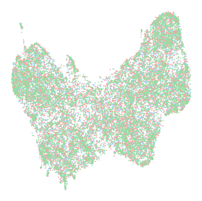
Let’s have a look at the distribution of points of the multi modal space:

Code
import matplotlib.pyplot as plt

# scatter plot of embeddings; color-coded by modality
fs = 10
s = fs*0.75
alpha = 0.7

# beautiful pastel hex colors
c_graph = "#A1C9F4"  # blue
c_wall = "#FF9F9B"  # red / pink
c_image = "#8DE5A1"  # green

fig, ax = plt.subplots(figsize=(fs, fs))
ax.scatter(emb_graphs_2d[:, 0], emb_graphs_2d[:, 1], label="A graphs", s=s, color=c_graph, alpha=alpha)
ax.scatter(emb_walls_2d[:, 0], emb_walls_2d[:, 1], label="S graphs", s=s, color=c_wall, alpha=alpha)
ax.scatter(emb_images_2d[:, 0], emb_images_2d[:, 1], label="Images", s=s, color=c_image, alpha=alpha)
# ax.legend(loc='upper center', fontsize=fs*1.5)
_ = ax.axis('off')

Embedding density using KDE

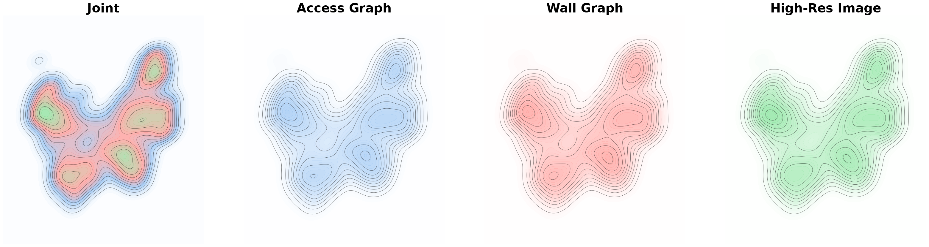
To generate a 3D landscape where height indicates the population density of projected embedding points, we use a kernel density estimation (KDE) on the points. Plotting the contour maps (done for the joint set and individual modality-specific embedding sets) yields a proxy for a meaningful landscape.
The next code cells 1) compute the densities and 2) plot them nicely.

Code
from scipy.stats import gaussian_kde

# helpers
def get_grid(embeds, n_grid=150, extent=0.2):
    diff_x = embeds[:, 0].max() - embeds[:, 0].min()
    diff_y = embeds[:, 1].max() - embeds[:, 1].min()
    x_min, x_max = embeds[:, 0].min() - extent*diff_x, embeds[:, 0].max() + extent*diff_x
    y_min, y_max = embeds[:, 1].min() - extent*diff_y, embeds[:, 1].max() + extent*diff_y
    X, Y = np.meshgrid(np.linspace(x_min, x_max, n_grid), np.linspace(y_min, y_max, n_grid))
    xy = np.vstack([X.ravel(), Y.ravel()])
    return X, Y, xy

def get_elevation_kde(points, XY, n_grid=150):
    kde = gaussian_kde(points.T, bw_method='scott')
    return kde(XY).reshape(n_grid, n_grid)

# hyper
n_grid = 300

# joint density
X, Y, xy = get_grid(umap_embeds, n_grid=n_grid)
Z = get_elevation_kde(umap_embeds, xy, n_grid=n_grid)

# modality-specific densities
# g: access graph, s: wall graph, i: image
X_g, Y_g, xy_g = get_grid(emb_graphs_2d, n_grid=n_grid)
Z_g = get_elevation_kde(emb_graphs_2d, xy_g, n_grid=n_grid)

X_s, Y_s, xy_s = get_grid(emb_walls_2d, n_grid=n_grid)
Z_s = get_elevation_kde(emb_walls_2d, xy_s, n_grid=n_grid)

X_i, Y_i, xy_i = get_grid(emb_images_2d, n_grid=n_grid)
Z_i = get_elevation_kde(emb_images_2d, xy_i, n_grid=n_grid)
Code
from matplotlib.colors import LinearSegmentedColormap

# hypers
fs = 10
alpha_c = 0.8
l_fine = 40  # fine level contours
l_coarse = 12  # course level contours
show_colors = True
show_lines = True

# color maps based on pastel colors defined before
cmap_joint = LinearSegmentedColormap.from_list(
    "CombinedPastels",
    ["white", c_graph, c_wall, c_image]
)
cmap_graph = LinearSegmentedColormap.from_list("PastelBlue", ["white", c_graph])
cmap_wall = LinearSegmentedColormap.from_list("PastelRed", ["white", c_wall])
cmap_image = LinearSegmentedColormap.from_list("PastelGreen", ["white", c_image])

# plot
fig, axs = plt.subplots(1,4,figsize=(fs*4, fs*1))
axs = axs.flatten()

for ax in axs: _ = ax.axis('off')

ax = axs[0]
_ = ax.set_title("Joint", fontsize=fs*3, weight="bold")
if show_colors:_ = ax.contourf(X, Y, Z, levels=l_fine, cmap=cmap_joint, alpha=alpha_c)
if show_lines:_ = ax.contour(X, Y, Z, levels=l_coarse, colors='black', linewidths=0.6, alpha=0.6)

ax = axs[1]
_ = ax.set_title("Access Graph", fontsize=fs*3, weight="bold")
if show_colors: _ = ax.contourf(X_g, Y_g, Z_g, levels=l_fine, cmap=cmap_graph, alpha=alpha_c)
if show_lines: _ = ax.contour(X_g, Y_g, Z_g, levels=l_coarse, colors='black', linewidths=0.6, alpha=0.6)

ax = axs[2]
_ = ax.set_title("Wall Graph", fontsize=fs*3, weight="bold")
if show_colors: _ = ax.contourf(X_s, Y_s, Z_s, levels=l_fine, cmap=cmap_wall, alpha=alpha_c)
if show_lines:_ = ax.contour(X_s, Y_s, Z_s, levels=l_coarse, colors='black', linewidths=0.6, alpha=0.6)

ax = axs[3]
_ = ax.set_title("High-Res Image", fontsize=fs*3, weight="bold")
if show_colors: _ = ax.contourf(X_i, Y_i, Z_i, levels=l_fine, cmap=cmap_image, alpha=alpha_c)
if show_lines: _ = ax.contour(X_i, Y_i, Z_i, levels=l_coarse, colors='black', linewidths=0.6, alpha=0.6)

Finally, we generate the 3D landscape by projecting the population density onto the Z-axis. Note that both the height and color indicate the population density level.

Code
import plotly.io as pio
pio.renderers.default = "notebook"
Code
import plotly.graph_objects as go
import numpy as np
from scipy.interpolate import griddata

show_points = False

# extract points
pX_g = emb_graphs_2d[:, 0]
pY_g = emb_graphs_2d[:, 1]
pX_s = emb_walls_2d[:, 0]
pY_s = emb_walls_2d[:, 1]
pX_i = emb_images_2d[:, 0]
pY_i = emb_images_2d[:, 1]

# joint set of points
pX = np.hstack([pX_g, pX_s, pX_i])
pY = np.hstack([pY_g, pY_s, pY_i])

# map points to exact surface height
pZ_g = griddata((X_g.flatten(), Y_g.flatten()), Z_g.flatten(), (pX_g, pY_g), method='linear')
pZ_s = griddata((X_s.flatten(), Y_s.flatten()), Z_s.flatten(), (pX_s, pY_s), method='linear')
pZ_i = griddata((X_i.flatten(), Y_i.flatten()), Z_i.flatten(), (pX_i, pY_i), method='linear')

# plus a tiny offset such that they appear above the surface
pZ_g += np.max(Z) * 0.05
pZ_s += np.max(Z) * 0.05
pZ_i += np.max(Z) * 0.05

# plot in 3D interactive plot
cmap_joint = ['white', c_graph, c_wall, c_image]
if show_points: cmap_joint = ['white', 'black']
fig = go.Figure()

z_scale = 0.5
fig.add_trace(go.Surface(x=X, y=Y, z=Z, colorscale=cmap_joint, showscale=False))

if show_points:
    fig.add_trace(go.Scatter3d(x=pX_g, y=pY_g, z=pZ_g, mode='markers',
                            marker=dict(size=2, color=c_graph), name="Access Graph"))
    fig.add_trace(go.Scatter3d(x=pX_s, y=pY_s, z=pZ_s, mode='markers',
                            marker=dict(size=2, color=c_wall), name="Wall Graph"))
    fig.add_trace(go.Scatter3d(x=pX_i, y=pY_i, z=pZ_i, mode='markers',
                            marker=dict(size=2, color=c_image), name="High-Res Image"))

fig.update_scenes(
    xaxis_visible=False,
    yaxis_visible=False,
    zaxis_visible=False,
    aspectmode='manual',
    aspectratio=dict(x=1, y=1, z=0.2) # compress z-axis for better viz ;)
)

fig.update_layout(title="Joint", margin=dict(l=0, r=0, b=0, t=40))

fig.show()

Alignment (un)certainty

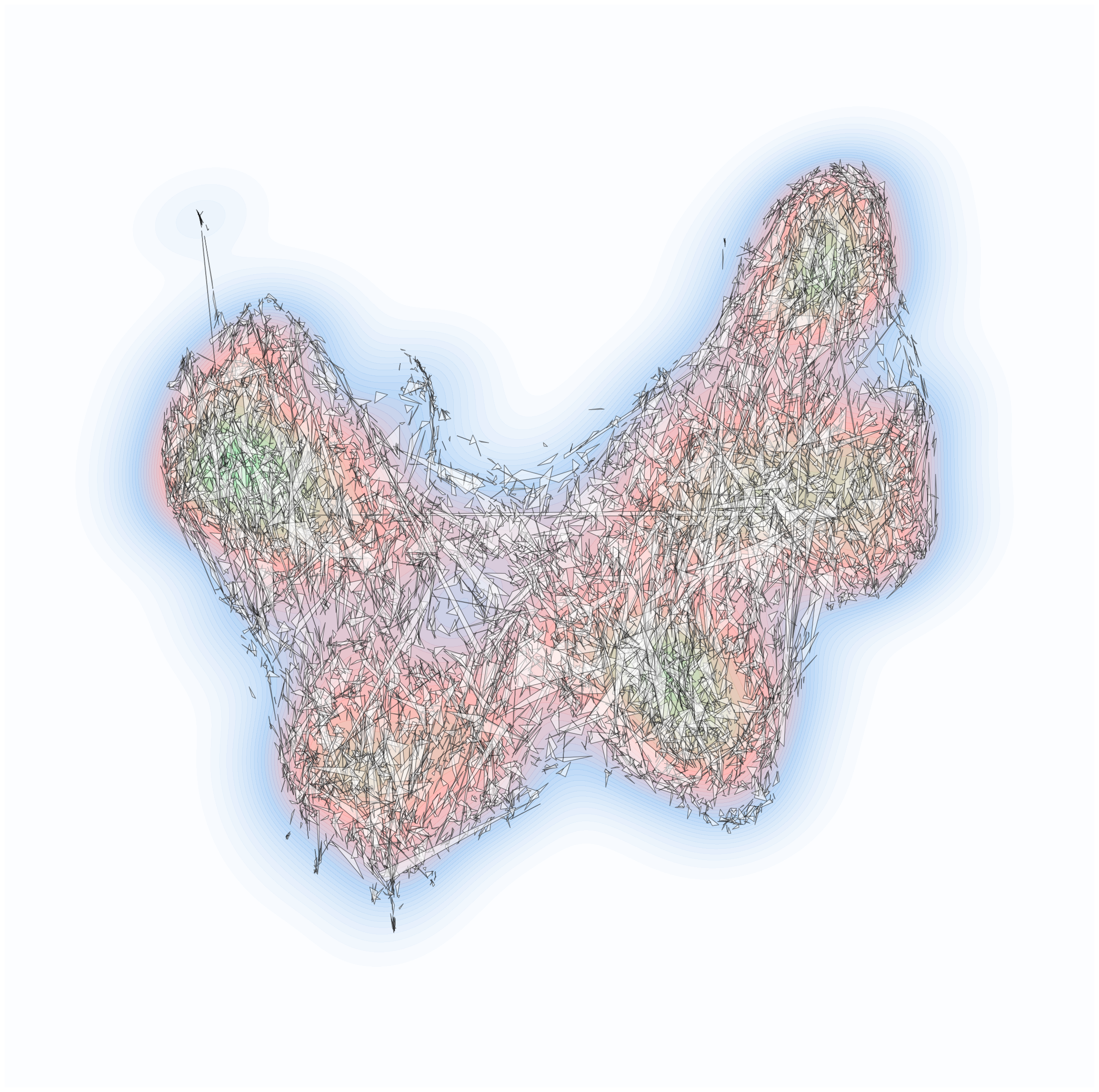
To inspect where the model is (un)certain about alignment, we visualize each floor plan as a triangle in which each point of the triangle is one of the corresponding projected embeddings that stem from one of the three modalities (graph, wall graph, image).

Code
from matplotlib.collections import PolyCollection
import numpy as np

cmap_joint = LinearSegmentedColormap.from_list(
    "CombinedPastels",
    ["white", c_graph, c_wall, c_image]
)

fs = 30
alpha_c = 0.7
alpha_t = 0.5

# stack points to define the vertices of each triangle
N = len(emb_graphs_2d)
np.random.seed(42)
idx = np.random.choice(len(emb_graphs_2d), size=N, replace=False)
triangles = np.stack([
    emb_images_2d[idx],
    emb_graphs_2d[idx],
    emb_walls_2d[idx]], axis=1)

# collection of triangles
triangle_collection = PolyCollection(
    triangles,
    facecolors='white',
    edgecolors='black',
    linewidths=fs/30,
    alpha=0.3
)

fig, ax = plt.subplots(figsize=(fs, fs))
_ = ax.axis('off')
# _ = ax.set_title(f"Modality Triplets (N={N})", fontsize=fs*2, weight="bold")
_ = ax.contourf(X, Y, Z, levels=l_fine, cmap=cmap_joint, alpha=alpha_c)

# triangles to plot
triangle_collection.set_alpha(alpha_t)
_ = ax.add_collection(triangle_collection)

Clearly, the model isn’t perfect: many triangles are large, which means that the alignment of heterogeneous representation of floor plans isn’t perfect as well. But how can we visualize where the model is more (or less) certain in alignment? This could, consequently, reveal with which type of spatial arrangement the model struggles with understanding.

To model the alignment (un)certainty, we simply compute the rank of each pair of ‘connected’ embeddings. Connected in the sense that each pair that we investigate comes from the same floor plan. The rank is computed based on the distance in the original (768D) space, which isn’t entirely reflected in the 2D representative we have plotted before. We compute the ranks next and provide the first 500 of them to investigate a bit the distribution:

Code
import numpy as np

def get_mean_rank(src_emb, tar_emb1, tar_emb_2):

    # l2 norm for fast sim computation
    s_norm = src_emb / np.linalg.norm(src_emb, axis=1, keepdims=True)
    t1_norm = tar_emb1 / np.linalg.norm(tar_emb1, axis=1, keepdims=True)
    t2_norm = tar_emb_2 / np.linalg.norm(tar_emb_2, axis=1, keepdims=True)

    # full similarity matrix
    sim1 = s_norm @ t1_norm.T
    sim2 = s_norm @ t2_norm.T

    # 'true' similarity = simply correspondence
    true_sim1 = np.diag(sim1)[:, None]
    true_sim2 = np.diag(sim2)[:, None]

    # rank
    rank1 = (sim1 > true_sim1).sum(axis=1) + 1
    rank2 = (sim2 > true_sim2).sum(axis=1) + 1

    return (rank1 + rank2) / 2.0

# modality-specific ranks
ranks_g = get_mean_rank(emb_graphs, emb_walls, emb_images)
ranks_s = get_mean_rank(emb_walls, emb_graphs, emb_images)
ranks_i = get_mean_rank(emb_images, emb_graphs, emb_walls)

# joint one
ranks_joint = np.concatenate([ranks_g, ranks_s, ranks_i])
print(ranks_joint[:500])
[1.  1.  2.  1.  1.  1.  1.  1.  1.  1.5 1.  1.  1.  1.  1.5 1.5 1.  1.
 1.  1.  1.  1.  1.  1.  1.  1.  1.  1.5 1.  1.  1.5 1.  1.  1.5 1.  1.
 1.  1.  1.  1.  1.5 1.  1.  1.  1.  1.  1.  1.  2.  1.  2.  1.  1.  1.
 1.  1.  2.5 1.  2.  1.  1.  1.  1.  1.  1.  1.5 1.  1.  1.  1.  2.5 1.
 1.5 1.  2.5 1.  1.  1.  1.  1.  5.5 1.  1.  1.  1.  1.  1.  1.  1.  1.
 1.  2.  1.  1.  1.  1.  1.  1.  1.  1.  1.  1.  1.  1.  1.  1.  7.5 1.
 1.5 1.  1.  1.  1.5 1.  2.  1.  1.  1.  1.  1.  1.  1.  1.  1.  1.  1.
 1.  1.5 1.  1.  1.  1.  1.  1.  1.5 1.  1.  1.  1.  1.  1.  1.  1.  1.
 1.  1.  1.  1.  1.  1.  1.  1.  1.  1.  1.  1.5 1.  1.  1.  1.  1.  1.
 1.  1.  1.  1.  1.  1.  1.  1.  1.  1.  1.  1.  1.  1.  1.  1.  1.  1.
 1.  1.  1.  1.  1.  1.  2.  1.  1.  1.5 1.  1.  1.  1.  1.  1.  1.  1.
 1.  1.  1.  2.  1.  1.  1.  1.  2.  2.  1.  1.  1.  1.5 1.  1.  1.  1.
 1.  1.  1.  1.  1.  1.  2.5 1.  1.5 1.  1.  1.  1.  1.  1.  1.  1.  1.5
 1.  1.  1.  1.  1.5 1.  1.  1.  1.  1.  1.  1.  1.  1.  1.  1.  1.  1.
 1.  1.  1.5 1.  1.  1.  1.  1.  1.  1.  1.  1.  6.  1.  1.  1.  1.  1.5
 1.  1.5 1.  1.  1.  1.  1.  1.  1.  1.  1.  1.  1.  1.5 1.  1.  1.  1.
 1.  1.  1.  1.  1.5 1.  1.5 2.  1.  1.  1.  1.  1.  1.  1.  1.  1.5 1.
 1.  1.  1.  1.  1.  1.  1.  1.  1.  1.  1.  1.  1.  1.  1.  1.  1.  1.
 1.  1.  1.  1.  1.  1.5 1.  1.5 1.  1.  1.  1.  1.  1.  1.  1.  1.  1.
 1.  1.  1.  1.  1.  1.5 1.  1.  1.  1.  1.  1.  1.  1.5 1.  1.  1.  1.
 1.  1.  1.  1.  1.  1.  2.  1.  1.  1.  1.  1.  1.  1.  1.  1.  1.  1.
 1.  1.  1.  1.  1.5 1.  1.  1.  1.  1.  1.5 1.  1.  1.  1.  1.5 2.  1.
 1.  1.  1.  1.  1.  1.  1.  2.  3.  1.  1.  1.  1.  1.  1.  1.  1.  1.
 1.  1.  1.5 1.  1.  1.  1.  1.  1.  1.  1.5 1.  1.  1.  1.5 1.  1.  1.
 1.  1.  1.  1.  1.  1.  1.  1.  1.  1.  1.  1.  1.  1.  1.  1.  1.  1.
 1.  1.  1.5 1.  1.  1.  1.  1.  1.  1.  2.  1.  1.  1.  1.  1.  1.  1.
 1.  1.  1.  1.  1.  1.5 1.  1.  1.  1.  1.  1.  1.  1.  1.  1.  1.  1.
 1.  1.  1.  1.  1.  1.  1.  1.  1.  1.  1.  1.  1.  1. ]

As you can see, the model is actually quite good, however not perfect.

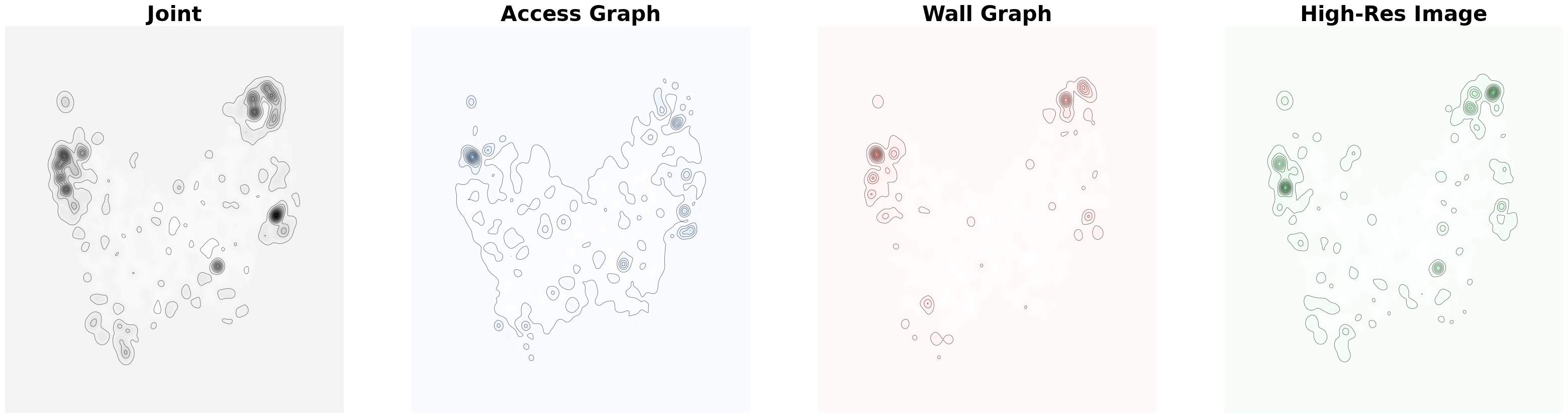
Similar to the population density, we compute a density map of the ranks (note that this is different from a density over simply points) and smooth it using a Gaussian:

Code
from scipy.stats import binned_statistic_2d
from scipy.ndimage import gaussian_filter
import numpy as np

def get_rank_surface_binned(points, ranks, X_grid, Y_grid, n_grid):
    # binned statistics
    stats, _, _, _ = binned_statistic_2d(
        points[:, 0], points[:, 1], ranks,
        statistic='mean', bins=n_grid,
        range=[[X_grid.min(), X_grid.max()], [Y_grid.min(), Y_grid.max()]]
    )
    Z_rank = stats.T

    # temporarily fill NaNs with the average rank just so the blur doesn't break
    Z_filled = np.nan_to_num(Z_rank, nan=np.nanmean(Z_rank))

    # smooth it
    Z_smooth = gaussian_filter(Z_filled, sigma=3.0)

    return Z_smooth

Z_rank_joint = get_rank_surface_binned(umap_embeds, ranks_joint, X, Y, n_grid)
Z_rank_g = get_rank_surface_binned(emb_graphs_2d, ranks_g, X_g, Y_g, n_grid)
Z_rank_s = get_rank_surface_binned(emb_walls_2d, ranks_s, X_s, Y_s, n_grid)
Z_rank_i = get_rank_surface_binned(emb_images_2d, ranks_i, X_i, Y_i, n_grid)
Code
from matplotlib.colors import LinearSegmentedColormap

# hypers
fs = 10
alpha_c = 0.8
l_fine = 40  # fine level contours
l_coarse = 12  # course level contours
show_colors = True
show_lines = True

# color maps based on pastel colors defined before
cmap_joint = "Grays"
cmap_graph = LinearSegmentedColormap.from_list("PastelBlue", ["white", c_graph])
cmap_wall = LinearSegmentedColormap.from_list("PastelRed", ["white", c_wall])
cmap_image = LinearSegmentedColormap.from_list("PastelGreen", ["white", c_image])

# plot
fig, axs = plt.subplots(1,4,figsize=(fs*4, fs*1))
axs = axs.flatten()

for ax in axs: _ = ax.axis('off')

ax = axs[0]
_ = ax.set_title("Joint", fontsize=fs*3, weight="bold")
if show_colors:_ = ax.contourf(X, Y, Z_rank_joint, levels=l_fine, cmap=cmap_joint, alpha=alpha_c)
if show_lines:_ = ax.contour(X, Y, Z_rank_joint, levels=l_coarse, colors='black', linewidths=0.6, alpha=0.6)
# if show_colors:_ = ax.contourf(X, Y, Z, levels=l_fine, cmap="Grays", alpha=alpha_c)
# if show_lines:_ = ax.contour(X, Y, Z, levels=l_coarse, colors='pink', linewidths=0.6, alpha=0.6)

ax = axs[1]
_ = ax.set_title("Access Graph", fontsize=fs*3, weight="bold")
if show_colors: _ = ax.contourf(X_g, Y_g, Z_rank_g, levels=l_fine, cmap=cmap_graph, alpha=alpha_c)
if show_lines: _ = ax.contour(X_g, Y_g, Z_rank_g, levels=l_coarse, colors='black', linewidths=0.6, alpha=0.6)

ax = axs[2]
_ = ax.set_title("Wall Graph", fontsize=fs*3, weight="bold")
if show_colors: _ = ax.contourf(X_s, Y_s, Z_rank_s, levels=l_fine, cmap=cmap_wall, alpha=alpha_c)
if show_lines:_ = ax.contour(X_s, Y_s, Z_rank_s, levels=l_coarse, colors='black', linewidths=0.6, alpha=0.6)

ax = axs[3]
_ = ax.set_title("High-Res Image", fontsize=fs*3, weight="bold")
if show_colors: _ = ax.contourf(X_i, Y_i, Z_rank_i, levels=l_fine, cmap=cmap_image, alpha=alpha_c)
if show_lines: _ = ax.contour(X_i, Y_i, Z_rank_i, levels=l_coarse, colors='black', linewidths=0.6, alpha=0.6)

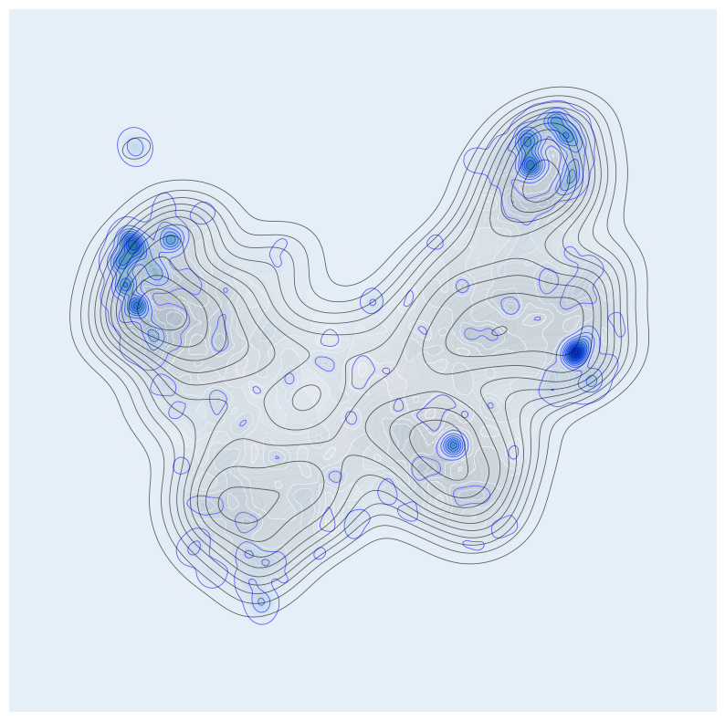
We can overlay the (un)certainty map (blue) on the point density map (gray). Done for only the joint embedding space.

Code
# plot
fs = 10
fig, ax = plt.subplots(figsize=(fs, fs))

_ = ax.axis('off')
_ = ax.contourf(X, Y, Z, levels=l_fine, cmap='Grays', alpha=alpha_c)
_ = ax.contour(X, Y, Z, levels=l_coarse, colors='black', linewidths=0.6, alpha=0.6)
_ = ax.contourf(X, Y, Z_rank_joint, levels=l_fine, cmap='Blues', alpha=alpha_c)
_ = ax.contour(X, Y, Z_rank_joint, levels=l_coarse, colors='blue', linewidths=0.6, alpha=0.6)

And visualize the entire landscape, including the embedding points in 3D

Code
import plotly.graph_objects as go
import numpy as np

show_points = True

# plot
cmap_joint = ['white', c_graph, c_wall, c_image]
if show_points: cmap_joint = ['white', 'black']
fig = go.Figure()

z_scale = 0.5
fig.add_trace(go.Surface(
    x=X,
    y=Y,
    z=Z,                           # The physical height of the 3D shape
    surfacecolor=Z_rank_joint,     # The array that dictates the colors!
    colorscale=cmap_joint,
    showscale=False
))

if show_points:
    fig.add_trace(go.Scatter3d(x=pX_g, y=pY_g, z=pZ_g, mode='markers',
                            marker=dict(size=2, color=c_graph), opacity=0.5, name="Access Graph"))
    fig.add_trace(go.Scatter3d(x=pX_s, y=pY_s, z=pZ_s, mode='markers',
                            marker=dict(size=2, color=c_wall), opacity=0.5, name="Wall Graph"))
    fig.add_trace(go.Scatter3d(x=pX_i, y=pY_i, z=pZ_i, mode='markers',
                            marker=dict(size=2, color=c_image), opacity=0.5, name="High-Res Image"))

fig.update_scenes(
    xaxis_visible=False,
    yaxis_visible=False,
    zaxis_visible=False,
    aspectmode='manual',
    aspectratio=dict(x=1, y=1, z=0.2) # compress z-axis for better viz ;)
)

fig.update_layout(title="Joint", margin=dict(l=0, r=0, b=0, t=40))

fig.show()

This landscape is then rendered in Unity, including putting the corresponding images of the different modalities on top of the points.